15+ Good Fonts for Reading

What is readability?
The readability of a text is related to how easy and enjoyable it is to read. And that’s where typography comes into play.
Reading flows much better in a text with a well-designed font, where the letters in the sentences are easily distinguished from each other and readily recognized by the reader.
Considering mobile devices, apps, and websites, choosing a font that facilitates reading is crucial for the user experience. This is not only important for the success of the app but also for the website’s ranking on Google, whose algorithm favors readable content that provides a good browsing experience.
For printed publications, it is also essential to assess whether the font is clear and sharp, even in smaller print sizes.
If you find it difficult to choose the ideal font for your text, whether printed or on screen, the first thing you need to do is familiarize yourself with the basics of typography. The Typography Fundamentals: Feel Confident With Type! course will be a good introduction to the basics of font choices.
Finally, reinforce your knowledge with Graphic Design Theory: Typography and learn how to choose and combine the best typefaces for your design project. This way, you’ll improve the quality of your work by consciously and effectively selecting the best font for reading and your graphic design.
Difference in readability among different fonts
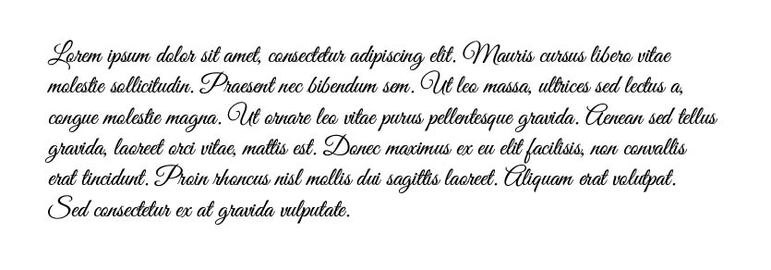
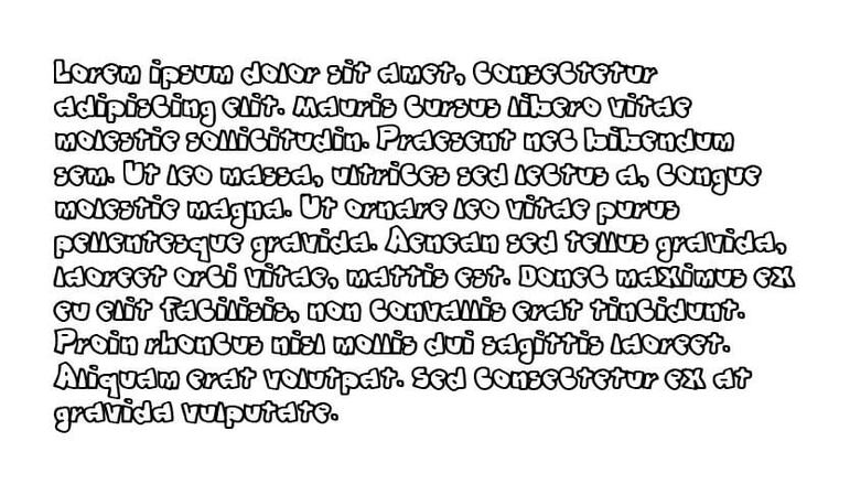
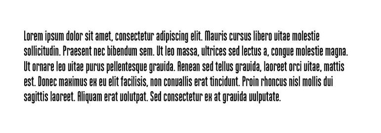
Below are examples of the same text written in different fonts.
The first is a “script” font, simulating the fluid stroke created by handwriting. Although cursive writing is one of the earliest forms of text creation by humans, it doesn’t provide good readability compared to more modern letters, especially when considering screens and mobile devices.
The second is a fantasy font with various extra and unnecessary details. This hinders readability and distracts the reader from the text’s message. Remember that an ideal font for good readability is one in which the shape of the letter goes unnoticed by the reader, and the only thing that matters is the message that the text conveys.
The third is a condensed font, where the type’s width is compressed more than usual.
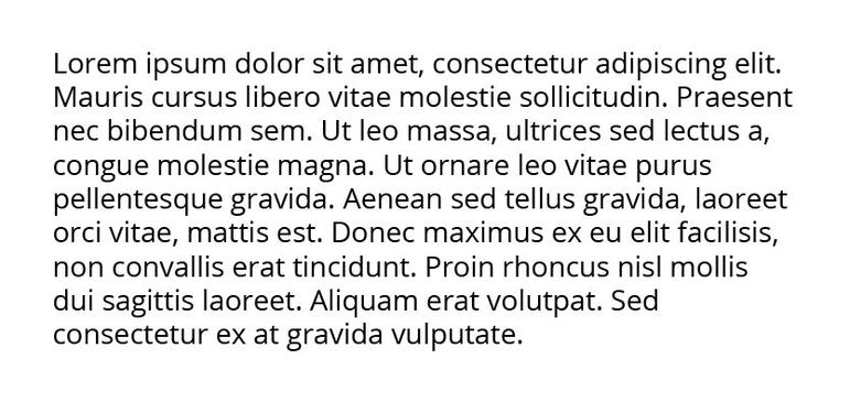
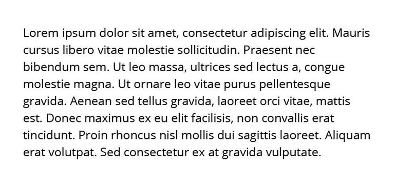
The fourth is the Open Sans font, with a simple letter design, good spacing, and a balanced height-to-width ratio.
Readability: Serif and Sans Serif fonts
Serif fonts have a little “feet” at the end of each letter, like an extension of the character’s final edge. Sans-serif fonts, on the other hand, lack these “feet.”
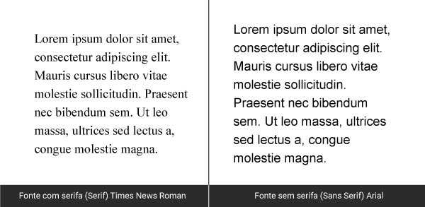
There has always been a debate about which type of font is more readable, serif or sans-serif. Some designers argue that serif fonts help guide and stabilize the reader’s gaze along the reading path. This fact is not entirely proven, as the way eyes move during text reading is not constant and rectilinear. The gaze “jumps” from one point to another in the text, casting doubt on the serif’s necessity as a guide for the gaze.
An article on this site presents some scientific studies on the readability difference between serif and sans-serif fonts. The conclusion is that, for adults without dyslexia or vision problems, there was no significant difference in reading efficiency between the two font types.
Currently, sans-serif fonts are more prevalent on screens and electronic devices. They are considered simpler and more modern.
The choice of font depends heavily on the graphic project and the identity that a design work aims to adopt. Remember that when choosing a font for commercial use, it is essential to check the usage licenses to avoid any misuse.
Below, we list some good fonts for reading, especially for long and continuous texts.
List of good fonts for reading
1. Georgia
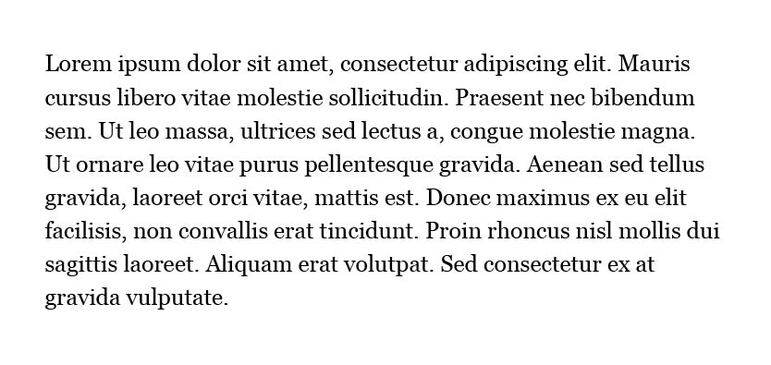
Georgia is a serif font designed by Microsoft to be elegant yet legible when printed in small formats or on low-resolution screens. Therefore, it is a good font alternative for running text.
2. Helvetica
Helvetica is a sans-serif font and one of the world’s most popular. It is a neutral font with great clarity in the design of its types.

3. Inter
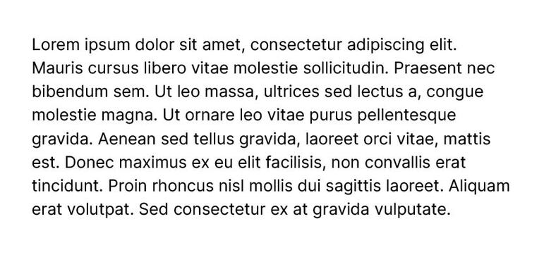
Inter is a font designed for mobile devices and on-screen texts. It is a simple and beautiful option for your texts.
4. Open Sans
Open Sans is a font created by Google and optimized for print web and mobile interfaces. It has good kerning, which is the spacing between the letters of a word, contributing to its readability.
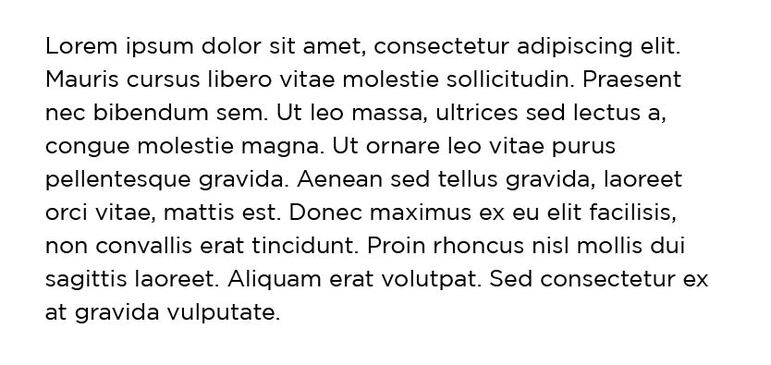
5. Gotham
Gotham is a geometric sans-serif font. It has a clear and clean design, excellent for those who need good text readability.
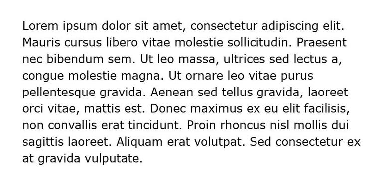
6. Verdana
Verdana is another sans-serif font created specifically for computer screens. It is an excellent choice for web design text due to its readability on screens.
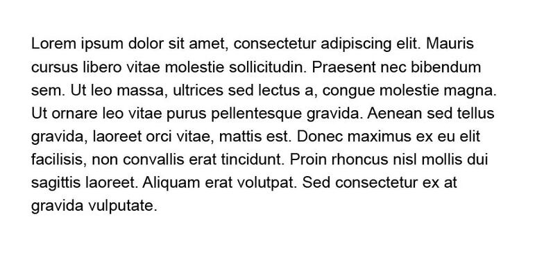
7. Arial
Arial is one of the most well-known fonts and comes pre-installed on computer operating systems by default. It may seem a bit “overused” and outdated, but it is still a simple and clear font in terms of readability.
Read also:
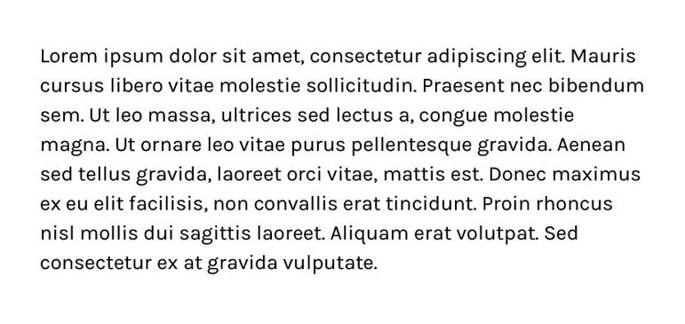
8. Karla
Karla is a simple and clear sans-serif font created by Google. Another good option for continuous texts that require good readability.
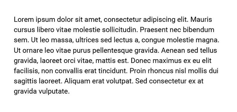
9. Roboto
Roboto is a serif font created by Google originally for use on the Android system. It is also used in the Chrome browser. It has a more “bold” characteristic compared to other fonts. It is a good font for reading and modern.
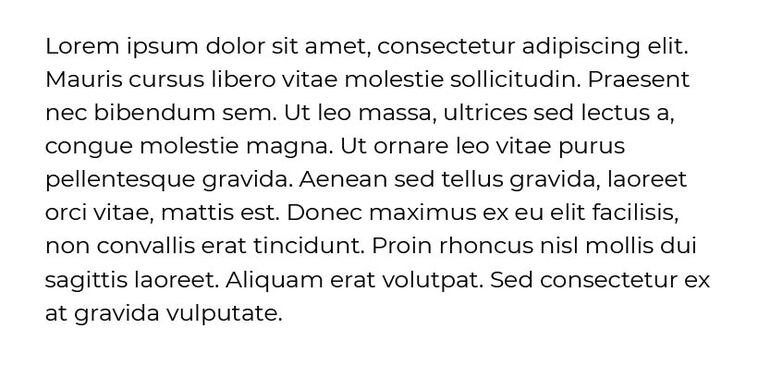
10. Montserrat
Montserrat is a sans-serif font with a geometric aspect. It was inspired by posters and signs in the Montserrat neighborhood in Buenos Aires. It has good readability even in small formats, making it a good option for printed materials.
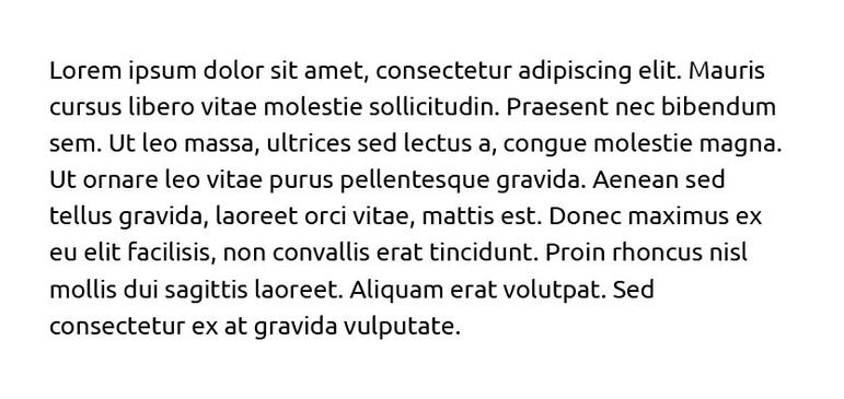
11. Ubuntu
Ubuntu is the default font of the operating system of the same name. It was designed to be modern and have a humanistic style.
12. Lato
“Lato” means “summer” in Polish. It is used in many printed materials such as signs and billboards. This font was designed to be efficient in a mass of text but also works well in larger sizes.
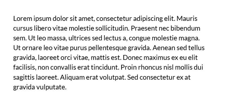
13. Quicksand
The Quicksand font was designed to be optimized on small screens and mobile devices. It has good readability and is a good option for designers.
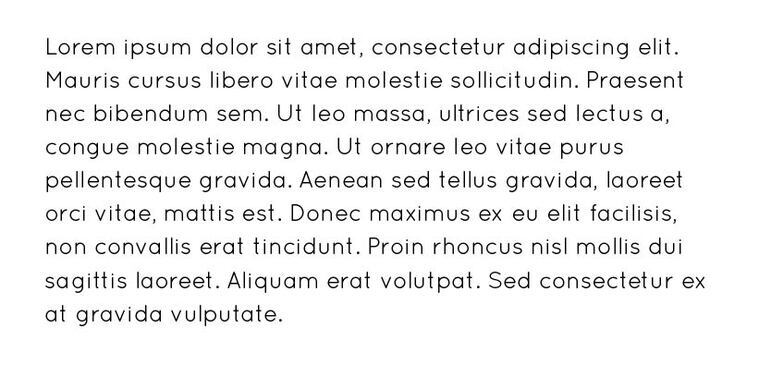
14. Futura
Futura is a simple and versatile sans-serif font. It works well for both formal and casual content. A good font option for text with good readability.
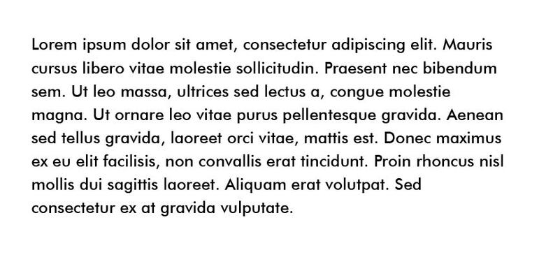
15. Avenir
Avenir was inspired by the Futura font and is a clear, simple, and readable sans-serif option.
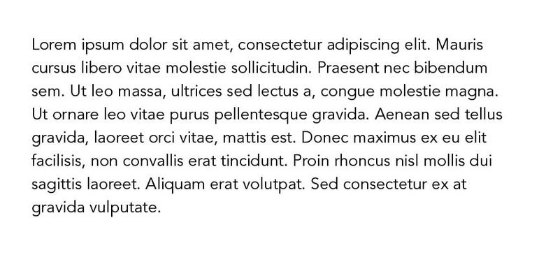
Choosing the right font is essential for good design work. Amidst the many font options available today, it’s generally not one of the easiest tasks to choose the ideal font.
Consider:
- Whether the graphic project will be printed, digital, or both;
- Whether typography will encompass the entire visual identity of a brand or will be used only in a graphic piece;
- Whether the chosen font will be used in a large block of text or only in a title;
- The scalability of the font. How much can we increase or decrease it without losing readability?
- The relationship with other fonts. We won’t always use the same font throughout the graphic project. The choice of font should consider how well it interacts with other types chosen for use in the visual project.
I hope this article has helped you choose the best font for reading. If it is useful, share it to help others.


