How to make an efficient lettering composition?
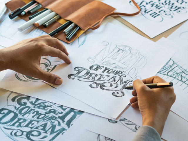
Lettering is the artistic practice of drawing letters or words. It is often confused with calligraphy, but there is a distinct difference. Calligraphy follows strict and specific rules, while lettering allows for more flexibility and the breaking of typographic conventions.
With lettering, we can embellish words and expand upon their meaning by incorporating aesthetic elements into the design.
When creating impressive lettering compositions, grids can be extremely beneficial. Grids serve as a valuable tool to guide and assist in creating visually pleasing arrangements.
Use of grids for a great lettering composition
When we encounter those mesmerizing lettering, which exudes a sense of balance, with compositions where the words seamlessly align, providing harmony and rhythm to the overall piece, we naturally wonder:
- How to achieve this result?
- How to compose the words so that the whole is cohesive and coherent?
- How to organize the elements of the composition to effectively convey the core message of the phrase or quote most optimally?
There are numerous techniques to produce lettering, specifically for creating compositions of phrases or quotes using lettering.
One of the most widely embraced techniques involves utilizing grids, which proves immensely beneficial for beginners embarking on their journey into the world of lettering.
Grids are an extensively employed tool in the design
The application of grids is a prevalent technique across various design disciplines, serving as a foundation for organizing and arranging diverse elements.
Whether for pamphlets, magazines, websites, logos, or compositions featuring geometric shapes, grids are invaluable in achieving balanced and harmonious outcomes.
Fundamentally, grids consist of a structure with rows and columns that help organize the placement of elements.
In magazine layouts, for instance, grids aid in composing images about text placement. The application of grids varies depending on the specific medium and its objectives.
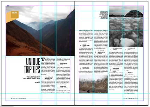
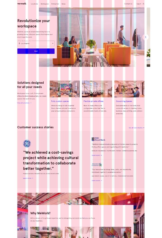
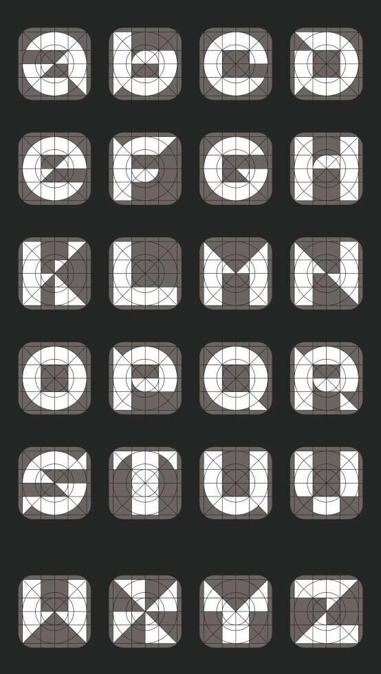
In addition to the uses mentioned earlier, designers can also employ grids to create lettering compositions.
Examples of grids to create lettering
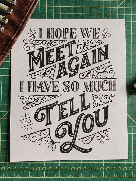
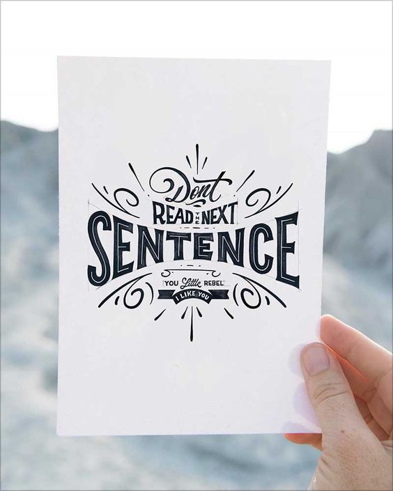
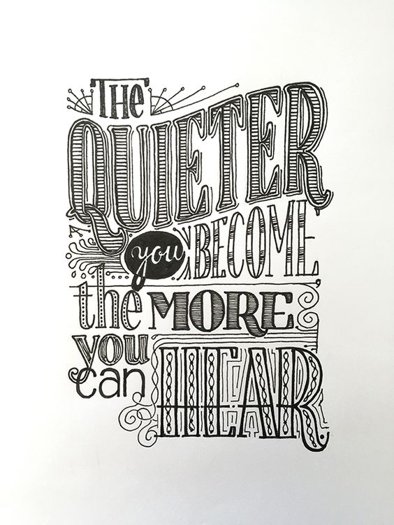
Here are some examples showcasing the use of grids in designing lettering compositions.
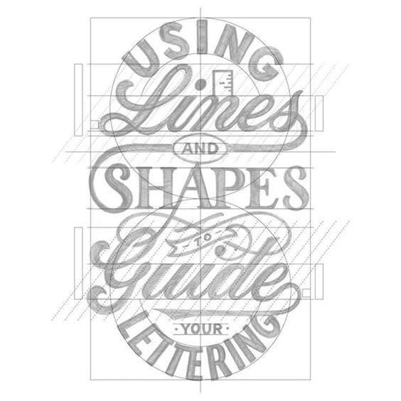
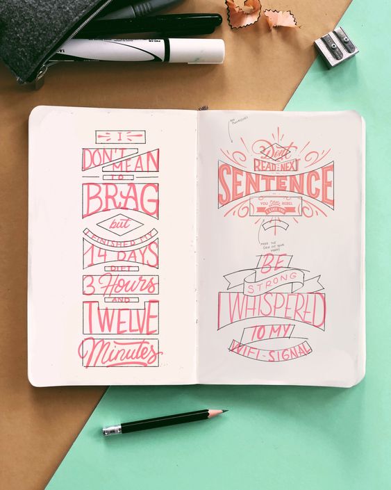
There are various approaches to creating a lettering composition.
- Some artists prefer to create lettering by drawing them freely, relying on their intuition and aesthetic sense.
- Others use grids as a guiding structure, but when drawing the words, they break free from any limitations they find necessary.
- Some artists rigidly adhere to the grid, using it as a systematic approach to organizing their ideas beforehand.
There is no absolute right or wrong method. Each artist chooses what works best for them.
Feel free to experiment with grids and observe how they may assist you. Utilizing a sketchbook can be helpful during this process.
Benefits of Using a Grid for Lettering Composition
Utilizing a grid can assist in organizing ideas, conveying the intended message, and determining the significance of specific words within a chosen phrase.
Feel free to draw the grid in a manner that suits your needs. While grids typically have a structure, you can establish your own guidelines.
For beginners, using grids can serve as a helpful starting point for exploring and practicing various lettering techniques.
Essential Elements of Lettering Composition
Before delving into grid design, it is crucial to understand some fundamental concepts about composition. These include:
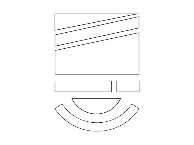
Asymmetry and Symmetry
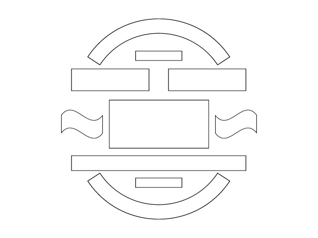
You can design lettering compositions with symmetrical or asymmetrical elements, each option contributing a distinct dynamic to the overall design.
Hierarchy
Within a sentence, some words hold more significance than others. By reading just these keywords, we can already understand the meaning of that sentence.
Within lettering, there is a hierarchy of words. Some need to be more prominent than others. And it is necessary to observe this scale to ensure that we design a grid cohesively and coherently.
Legibility
While lettering often incorporates ornaments, illustrations, and unconventional letterforms, it is still crucial to prioritize the legibility of the written content.
After all, effectively conveying the message is a primary objective for lettering artists.
When designing grid shapes and boundaries, it is crucial to consider the size of the words and how they will fit within geometric forms.
A single shape does not necessarily have to accommodate only one word. You can fit multiple words in a single line of the grid. However, it’s crucial to consider whether such an arrangement improves or hinders word readability.
Of course, there are no strict rules of right or wrong. Depending on the purpose and intended message, one can push boundaries. You can compress or elongate words to evoke specific emotions.
Some lettering intentionally sacrifices legibility for the sake of artistic form. While this can be a deliberate choice by the designer, it is still crucial to be mindful of this aspect and make conscious decisions accordingly.
Rhythm
The combination of these factors mentioned earlier creates rhythm. It determines the flow of reading and the movement of the reader’s eyes.
The arrangement of shapes, whether symmetrical or asymmetrical, and the use of highlights, illustrations, and ornaments all influence the direction of the reader’s gaze. Certain elements may capture more attention than others. For instance, a word written diagonally disrupts the typical horizontal reading pattern.
These factors contribute to the rhythm of a lettering composition, making it an important consideration when designing your layout.
A step-by-step guide to starting using grids in lettering composition
Follow a simple step-by-step guide with some study and practice suggestions to begin your lettering composition using grids.
1 – Choose the phrase you want to illustrate
The first step is to select a phrase for illustration. Choose something you love—a line from a song, a quote from a favorite text, or a well-known saying.
Once you have chosen the phrase, it’s time to identify the keywords that carry the central message. These are the words that you should highlight in your composition.
Be mindful of the highlighted words, as they will be the first elements the reader sees. It’s crucial to consider the meaning conveyed by these words when read together.
For instance, consider the sentence:
“If the journey is tough, it’s because you are on the right path.”
If you choose to highlight the words “journey,” “tough,” and “path,” they will be the first words the reader encounters in the lettering.
Journey, tough, path: When taken out of context, these three words may convey a meaning that contradicts or deviates from the primary message of the quote, don’t they?
Therefore, paying close attention to these details is of utmost importance.
2 – Generate ideas about the meaning of each word
When creating the grid, feel encouraged to use any shape you believe works best. Rectangles, squares, triangles, circles. Shapes with diagonal, vertical, or horizontal alignments. Sharp angles or smooth curves.
Each geometric shape can evoke various sensations such as aggression, fluidity, grandeur, or subtlety.
Keeping this in mind, take some time to explore and brainstorm the sensations conveyed by the keywords in the phrase.
By following this approach, you will develop a clearer insight into which geometric shape best aligns with the design and intended meaning of each word.
3 – Begin creating your grids
Now it’s time to dive into the grid construction phase. Let the experimentation begin!
You can use traditional pen and paper or choose your preferred digital drawing software.
Start by sketching several small grids on a sheet of paper. Remember, these are rough drafts, so perfection is not necessary. The goal is to test what works and what doesn’t.
Based on your analysis of the meaning behind the chosen phrase, explore different shapes as you draw.
Let your imagination run wild during this stage. Don’t shy away from experimentation.
As previously mentioned, emphasize the most important words. Select geometric shapes that accentuate these words and effectively convey their intended meaning.
You can design your grid with either a symmetrical or asymmetrical shape, allowing for flexibility in your composition. Additionally, you can choose between a more square or circular structure for your design.
You can also include decorative elements, ornaments, or small illustrations in your lettering. These additions can further enhance the intended message. These additions can further improve the intended message.
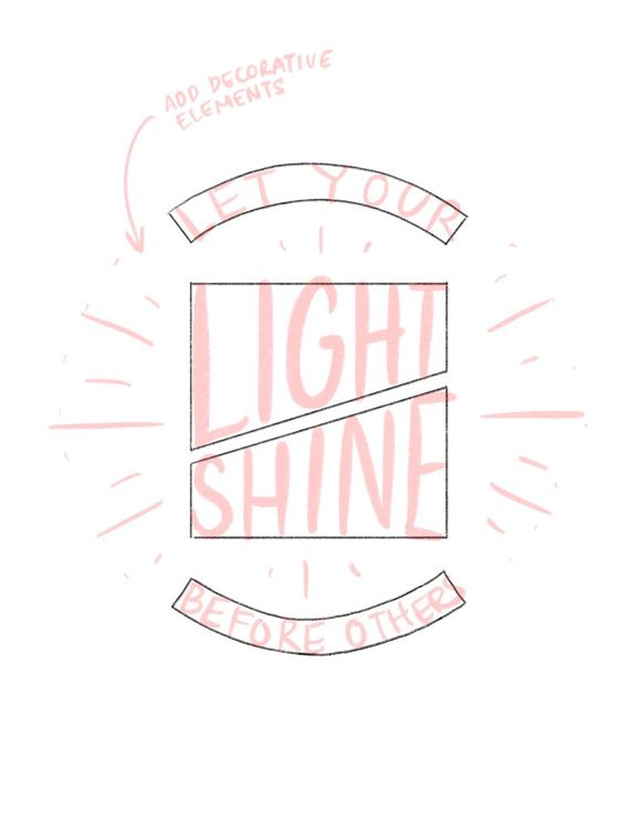
The lettering above features the phrase: “Let your light shine before others.” This phrase conveys the meaning of allowing others to see your inner light.
The words “Light Shine” stand out in the composition. They are placed within two complementary asymmetrical geometric shapes, creating a visually dynamic effect.
To enhance the message of the phrase, illustrative ornaments in the form of light shines are incorporated, adding visual interest and reinforcing the meaning.
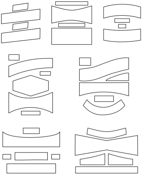
Below are examples of different grid shapes that can inspire your compositions.
Now it’s time to transfer the words into the grid. Once you have drawn several small grids, you can then choose the ones that strongly resonate with your personal preferences. Scale them up and begin writing the words inside.
This step involves the actual process of drawing the letters and words within the pre-determined grid format. It is an important stage in lettering construction. To inspire you, here are some examples of lettering designs:

