How to use Color Brightness Contrast to create more attractive designs?

Color contrast is a fundamental element of visual language and can influence how we perceive images. It is a powerful tool to make your designs and illustrations more attractive and impactful. In this article, we’ll explore how the contrast of luminosity between colors affects the dynamics of the design or illustration.
What is Brightness Contrast Between Colors?
Color brightness contrast is the difference between the brightness of one or more colors. In other words, it’s the distinction between the lightness and darkness of color about others. The greater the brightness contrast, the easier it is to distinguish various colors present.
Brightness-contrast is crucial in graphic design, impacting readability and overall appearance. High contrast makes the text easier to read, whereas low contrast makes it more difficult.
In illustrations, this also happens. A high-brightness contrast provides a vibrant dynamic, while a low contrast brings softness and subtlety. Whether to use high contrast or not is an artistic choice, depending on the message and feeling the illustrator wants to convey.
Mastering brightness contrast between colors allows us to make conscious and better choices when selecting a color palette. With this mastery, we can create superior illustrations and designs.
The Role of Brightness Contrast in Color Harmony
Think about the following situation. You’ve chosen a beautiful color palette. You researched, tested, and experimented. Then, you came up with a final set of colors that seemingly fit perfectly with the design or illustration you drew.
However, upon utilizing these palette colors in your project, the palette doesn’t appear favorable. Regardless of the style of the illustration, the design, the stroke, or the theme, the use of this palette seems to need a little more dynamics and life.
Have you experienced this situation before?
If you relate to this scenario, you might be overlooking a detail that will make all the difference: the brightness contrast between colors.
Simultaneous Contrast: How Do We Perceive Colors?
Colors are a sensation produced in the brain when light falls on an object and reflects at a specific wavelength.
The wavelength of the light reflected by the object reaches our eyes and forms a color within the visible spectrum of human vision.
The wavelength is the same. The color is the same. However, our brain doesn’t always interpret it that way. This fact is what we call Simultaneous Contrast.
Simultaneous Contrast is a visual phenomenon that occurs when we perceive two adjacent colors as being more or less bright than they are. This event happens because the surrounding colors influence our perception of the brightness of a color.
Color can appear different from what it is, depending on the context.
This feature of color theory is beneficial for illustrators, designers, and visual artists.
Thus, the perception of a color changes depending on the other colors that interact with it.
Look at the picture below. There are two circles in squares of different colors. Which circle has the lighter color? Is the circle in the pink square or the violet square?

They are the same color.

The background color gives us the feeling that one circle color is lighter than the other.
Our perception of a color changes according to the colors that are around it.
Now look at this other example:

Yes, the colors of the circles are the same. But which stands out more? Which one is more visible?
I believe, for most people, the circle on the left is more prominent. It’s easier to perceive amidst the background color than the circle on the right, isn’t it?
The set on the left is more pleasing to the eye. It does not require as much effort from our brain to differentiate the colors. Because the brightness of the background color is very different from the brightness of the circle color.
The contrast between “light” and “dark” in the left set is better than on the right.
Imagine in an illustration or design. If there are parts of the artwork where these two colors interact, which one would stand out more? Which colored circle would emphasize more within the graphic project?
Simultaneous contrast alters our perception of color based on the surrounding others, and the difference in brightness between them is one way we experience this sensation.
Brightness and Value of Colors
If you’ve used software such as Adobe Illustrator, Photoshop, or any other that includes the “Brightness” function in its color settings, you probably already understand how this function can alter the color.
Note: When we talk about brightness in this specific case, we are talking about the light emitted by the monitor.
Monitor colors typically utilize the RGB model. This model employs red, green, and blue to create all other colors, and the intensity of emitted brightness defines lightness and darkness.
The value of a color in image editing software refers to the scale of black and white that color possesses.
In the value scale below, 0 (zero) is the value for pure black, and 100 represents white. Intermediate values produce varying shades of gray. The higher the value, the lighter the color will appear.

The value scale adjusts the brightness of the color. A color will be “brighter” or have more “luminosity” the higher the value.
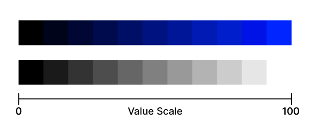
The value of color changes its brightness contrast.
Let’s go back to the example of green circles and squares. Using Illustrator’s HSB panel, let’s observe the difference in brightness (value) between the two sets:

In the example above, the square’s brightness (value) is 100%, while the circle’s is 67.84%.

In this second example, the square’s brightness is 78.82%, and the circles remain at 67.84%.
The contrast between the brightness of the square and the circle is more pronounced in the first example compared to the second. This fact leads to a higher contrast effect. Apparently, the circle contains more “black color” than the square.
How can I adjust the color value in Illustrator and Photoshop?
If you want to change the brightness of colors in Illustrator and Photoshop software, follow this short and quick tutorial:
Changing the color value in Illustrator
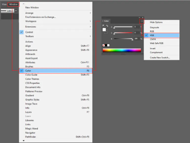
To access the HSB panel in Illustrator, go to Window > Color or use the shortcut F6. The Color window will open. Click on the icon with three dashes at the top left of the panel and choose the HSB option.
Changing the color value in Photoshop
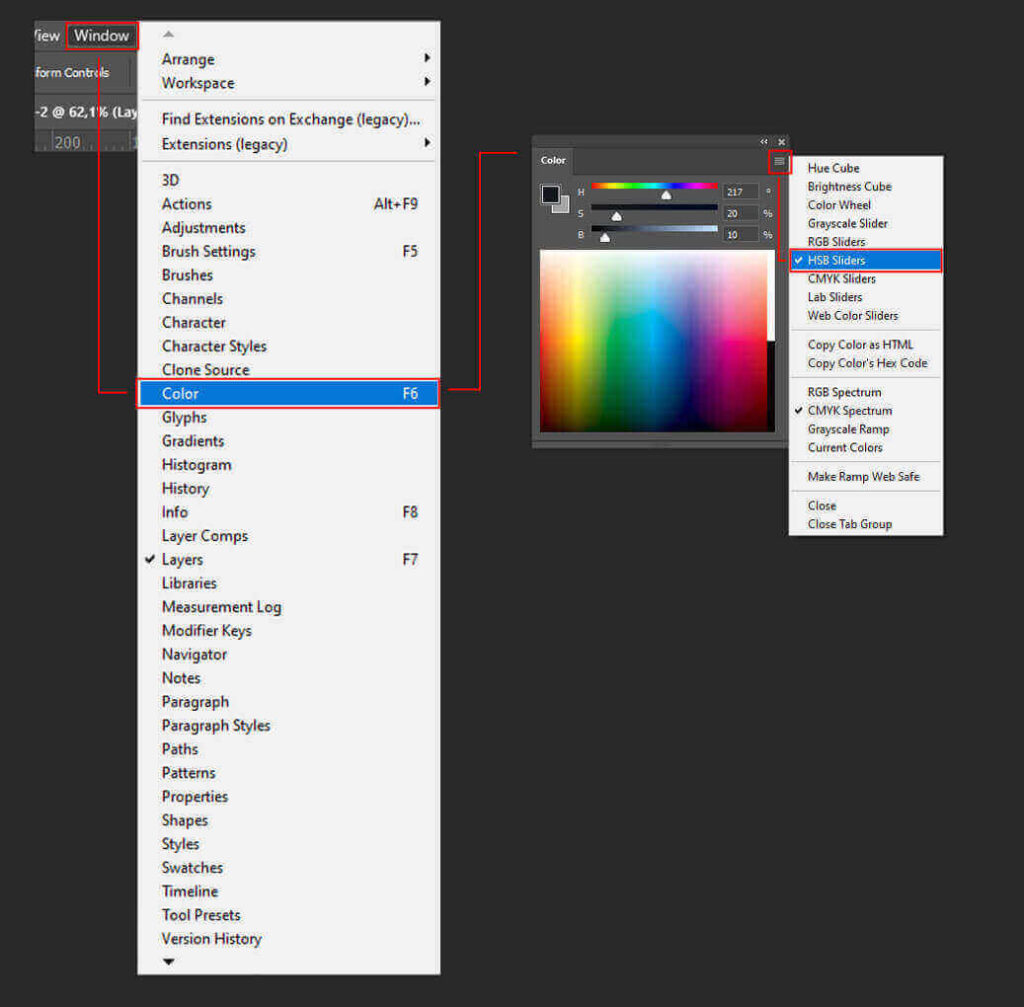
Go to the Window > Color menu or use the F6 shortcut. The Color window will open. Click on the three dashes at the top left of the panel and select the HSB slider option.
How do I know if the brightness contrast between colors is good?
Take a look at the two illustrations below. Which one has the better color choice?

If you choose the image on the right, it’s precisely due to the brightness contrast between the colors.
The brightness of the colors contrasts more in the second image, so the perception of a color is more prominent in the set.
On the other hand, the second image appears more subdued, less vibrant, and less dynamic.
This event is because the brightness levels of the colors are very close.
It’s important to note that there are no rules in art. There are no rules in creation. The decision to create more brightness contrast between colors depends on the feeling you want to evoke in people. The difference is that now, these choices will be conscious, right?
Testing color contrast
We’ve already seen that one aspect of brightness contrast between colors lies in the difference between “light” and “dark” among them.
So, observing the image in black and white will give a better sense of the differences in color values.
See the difference between the two illustrations when we switch them to black and white.

The range of grayscale in the image on the right is broader.
The image on the left has shades of gray very close. The colors are more monotonous, dull, and less vibrant.
Learn how to convert the image to black and white in Illustrator and Photoshop.
Change the image into black and white in Illustrator.
Click on the “Rectangle Tool” or use the shortcut key M. Create a black (#000000) square over the illustration.
Go to the Window > Transparency menu to open the transparency window.
With the black square selected, choose the “Saturation” blending mode in the newly opened transparency window.
The illustration will turn black and white. The black square with the applied blending mode acts as a filter over the image.
The advantage of this method is that you can remove the square from the illustration and still have the option to see the colored image beneath it.
This way, you can make any adjustments and place the square back over the drawing to restore the black-and-white image.
Change the image into black and white in Photoshop.
With your drawing on a Photoshop layer, go to the Layer > New Adjustment Layer > Hue/Saturation menu.
The “New Layer” window will appear, where we will generate an adjustment layer that impacts the layer containing the illustration. You can assign a name to the new layer within this window and click “OK”.
A “Properties” window will appear. Go to “Saturation” to change the layer’s saturation. Slide the pointer to the left. You’ll see your drawing lose its saturation and turn black and white.
This way, you can deactivate the adjustment layer (using the “eye” icon on the left side of the layer) and view the colored illustration to make potential adjustments.
Convert images to black and white on online websites.
If you don’t have any of the software or want something faster, you can use online tools that perform this conversion for free.
Brightness contrast enhances the legibility of a design
When reading a text, we need high contrast between the background and the written text. The higher the brightness contrast, the more readable the words will be.
When considering a graphic design with text, keep this contrast in mind. A significant difference in brightness between the background and the text is necessary to prevent the reader from struggling and to communicate the project’s message.
The Adobe Color website provides a contrast checker between background and text.
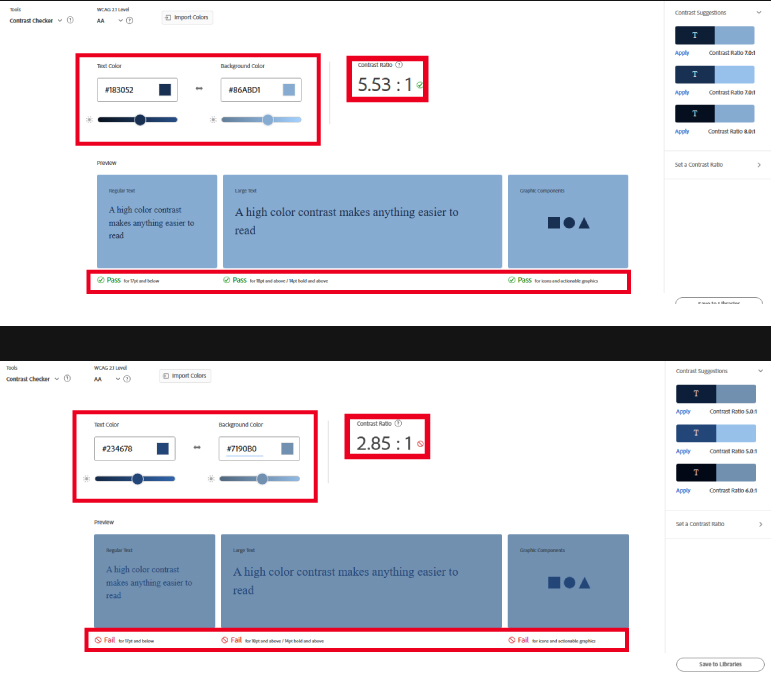
The readability of a text is not only about the brightness contrast to determine whether it is readable or not. As mentioned earlier, the simultaneous contrast between colors influences how we perceive color. And that perception depends on the other colors around it.
Some colors, such as complementary, can lead to low legibility even with high bright contrast. Therefore, it’s advisable to test all these aspects. Online tools, like Adobe, assist us in this task.
The power of brightness contrast between colors in illustrations
We’ve explored the concept of contrasting colors based on their luminosity. Now, let’s delve into a few examples that showcase the creative possibilities achievable with these contrasts.
Luminance contrast between colors to create light
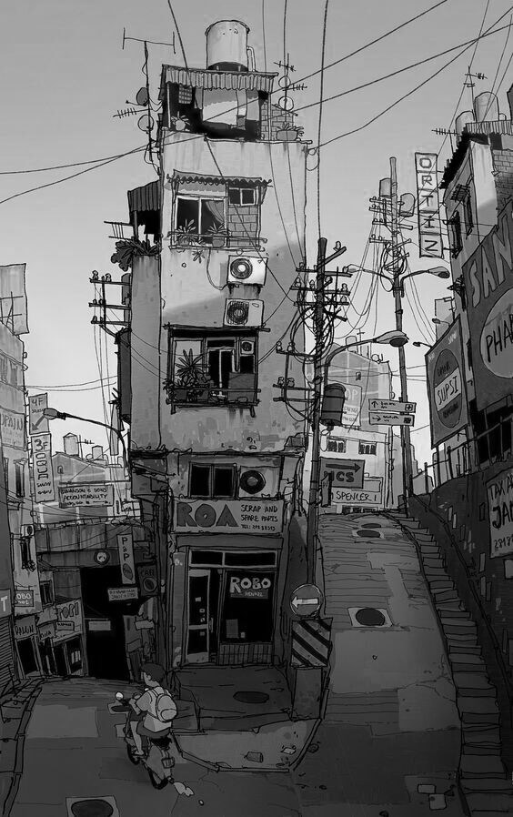
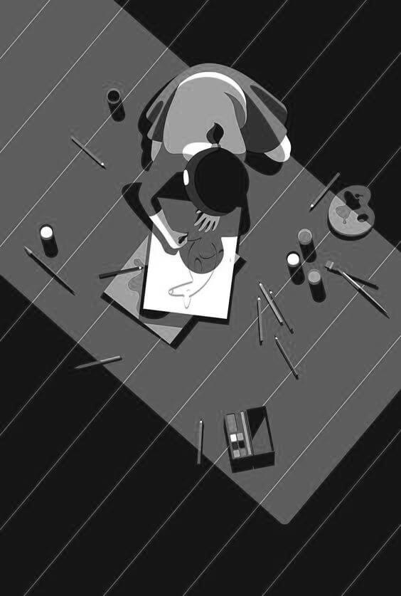
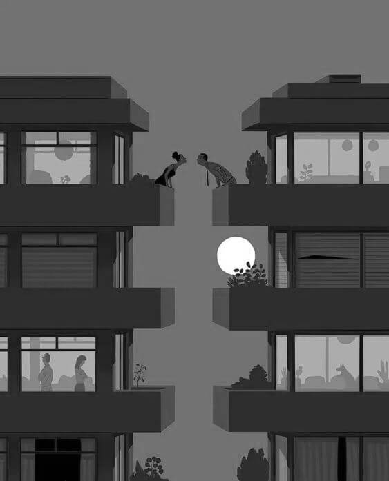
As the name implies, luminance contrast is relative to light. So, it becomes an ideal tool to create a light feeling in illustrations.
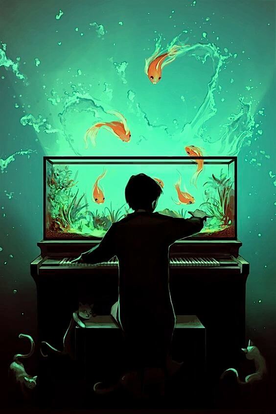
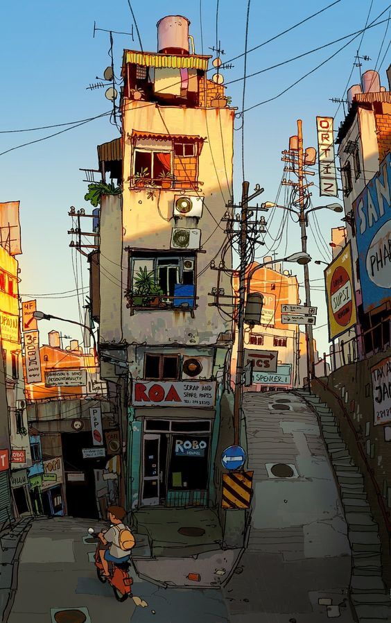
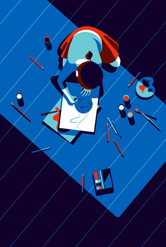
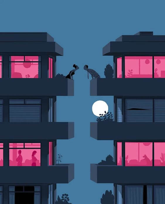
By desaturating (turning to black and white) the images above, we can better perceive the difference in luminance.
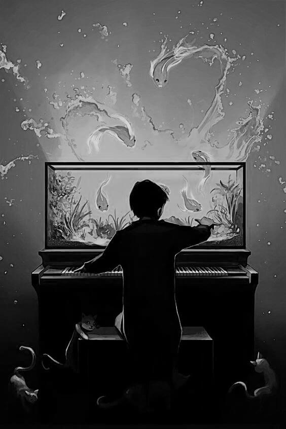
We can also use lower brightness contrast.
There are no strict rules in artistic creation. Everything depends on the message and feeling that the artist intends to convey.
The illustration below doesn’t exhibit as pronounced a brightness contrast as the ones above. However, combined with the use of analogous colors, the low contrast works effectively in conveying a sense of calmness and consistency.
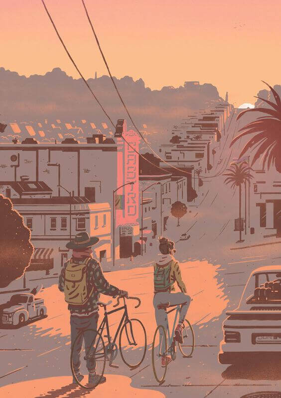
See the black and white version.
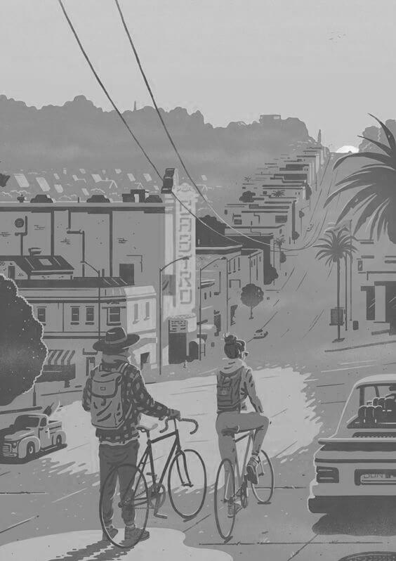
Comparing grayscale ranges
The TinyEye Labs website provides a tool to extract color palettes from images. What’s intriguing about this site is its ability to map colors and present the percentage of each color’s presence. We can apply this same logic to black-and-white photos to understand the grayscale levels present.
Take a look at the results for all the illustrations shown above:
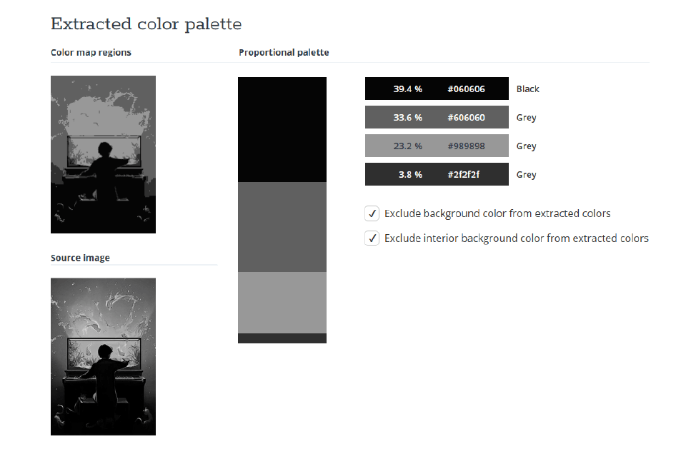
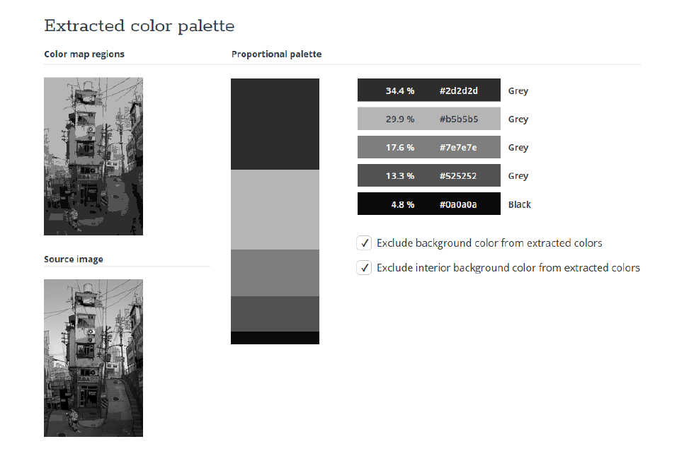
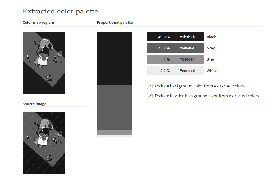
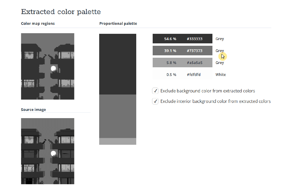
Look at the difference in contrast between the grays of an illustration with lower luminance contrast than the other images.
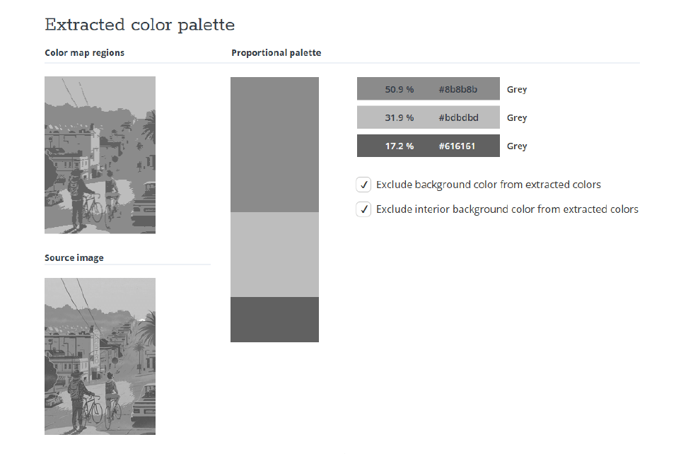
Work with colors consciously.
Colors hold immense power. Understanding their characteristics and how to manipulate them will aid you in making informed decisions and elevate your artistry to a new level.
Through consistent practice and observation, you will progressively gain mastery over colors and their contrasts. Consequently, you’ll have a much deeper command over the emotions they can evoke in your illustrations.


